Case study · Software · In progress

Requirements to running software

An internal pricing application rebuilt as a working, design-system-faithful front end — thirteen numbered builds, driven entirely through Claude, from meeting recordings and Figma exports to code that runs in a browser and behaves like the product. Not linked frames. Real state, real validation, real approval logic, and markup a React team can lift.

What this is

Underwriters price pharmacy benefit proposals: load a prospect’s claim file, price it, review the resulting offer, approve it. The existing tool spread that across hand entry, role handoffs, drawers and tabs.

The input was a mess, which is the point. Meeting recordings, call notes, a screen recording of the current tool, screenshots of the existing workspace, brand mockups and Figma exports. No clean specification. That is what a real project looks like before somebody turns it into something.

The output is software. A single HTML file that runs in any browser with no server and no build step, where the queue updates as work happens, files upload and validate, hydration runs, and approval locks and unlocks against real rules.

This deliberately bypassed the usual design process. It did not bypass the design system — that got rebuilt as code and applied to every screen.
13
numbered builds, none overwritten
33
requirements, each traced to a named source
23
design tokens extracted from Figma exports
63
automated checks in the largest test run
~80 min
of recorded sessions analysed into requirements
Try it yourself

This is the actual prototype, not a video of one. Open a Ready item to reach the full offer. Open the one marked Needs review to fix a broken claim file and re-check it. Upload any file you like — it accepts them. All figures are illustrative.

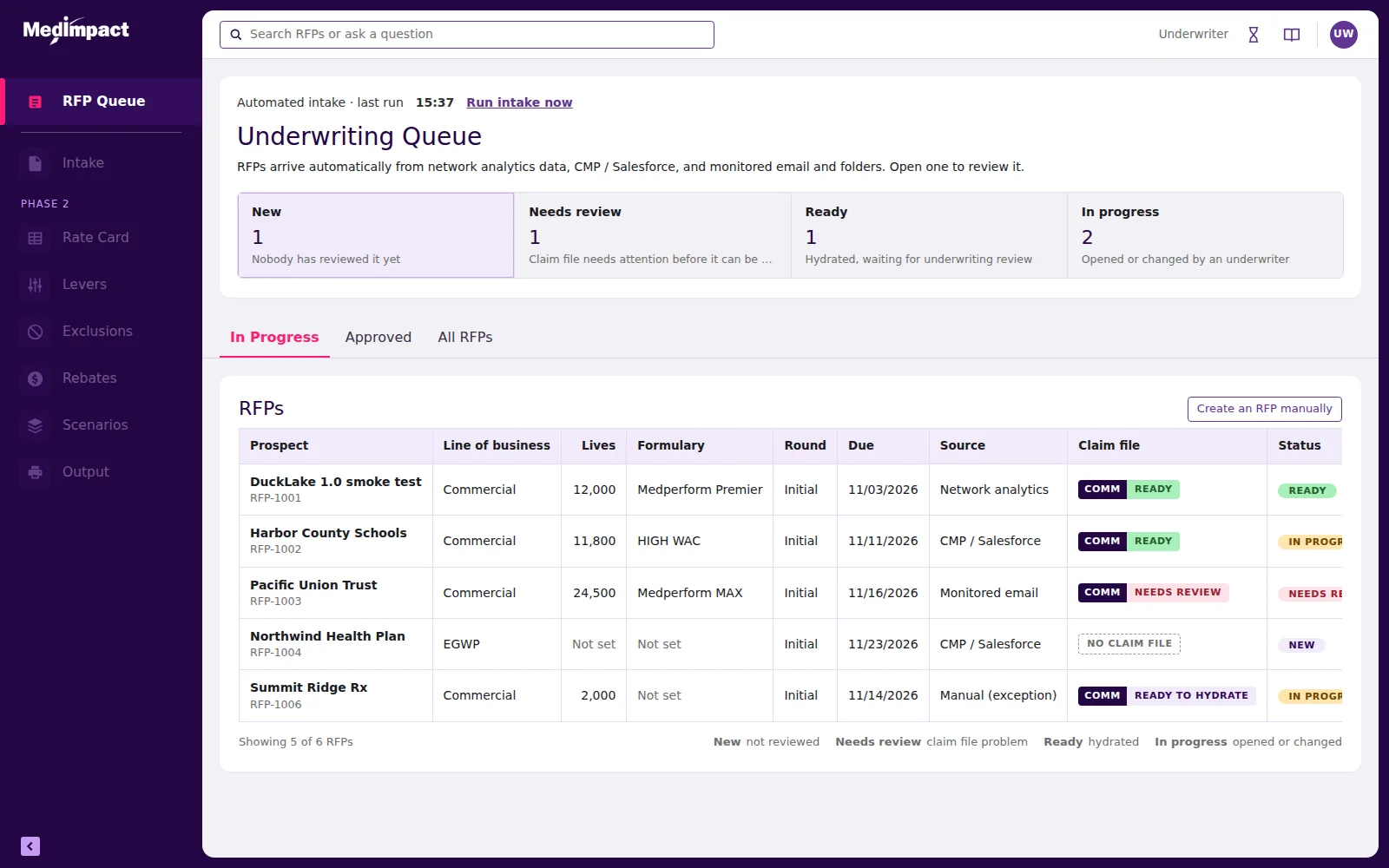
Underwriting queue: status tiles counting New, Needs review, Ready and In progress, above a table of proposals with line of business, source, claim-file state and status.

The underwriting queue — click to open the running prototype in a new tab

How the code is built

The useful question about an AI-built prototype is not whether it runs. It is whether an engineering team can do anything with it afterwards. This one was written so they can.

One state object, pure renders

All application state lives in a single object — current view, open record, filter, panel, draft edits, unsaved-change guard. Eleven render functions read from it and return markup: the nav, the top bar, the header card, the queue, the intake wizard, the offer body, the slide-over panel. Nothing reads the DOM to decide what to do next.

Render from state. The same model React uses.

Why that makes it React-ready

Those render functions are component boundaries already drawn. Each takes state and returns UI with no hidden dependencies, so porting is mechanical rather than interpretive — the queue renderer becomes a Queue component, the panel renderer becomes a Panel, and the state object becomes a store or a context. The data constants are hoisted out of presentation, so they move as-is.

Hand it over, or rebuild it properly. Both are cheap.

Tokens, not hard-coded colour

Twenty-three CSS custom properties carry the navigation plum, the active state, the accent pink, the lilac table headers, the rules, the status greens and the label greys. Every component references them. One token change propagates everywhere, which is why a late instruction like “make every table match the hydrated page” was a single edit rather than a sweep.

A theme file in waiting.
Zero dependencies. No framework, no bundler, no CDN, no build step — one file a stakeholder can open from an email attachment on a locked-down corporate laptop, and an engineer can read top to bottom in an afternoon.

The design system came from Figma, as code

The point was a prototype that looks and behaves like the real product, not a generic approximation of it. The design system lives in Figma, so the exports were the bridge.

Step 01

Extract

From image exports, not guesswork.

  • Sampled, not eyeballed. Figma frames were exported as images — expanded and collapsed navigation with hover and active states, a search screen, an overview and a detail screen — then analysed programmatically, sampling pixel colours from specific regions to derive exact values for navigation, active states, accents, rules, badges and status colours, and measuring the spacing and sizing patterns around them.
  • Components identified from the frames. Collapsible left navigation with an icon chip and an accent active bar, top bar with search, header card with a meta line, tabs with an underline, label-over-value fields, lilac-header tables, status pills, filled and outlined buttons.
Step 02

Encode

Tokens and shared render functions.

  • Tokens became CSS custom properties; components became shared functions. Every new screen reuses the same building blocks rather than reimplementing them, so the tenth screen costs a fraction of the first and late corrections land everywhere at once.
  • A new pattern composed from existing parts. The slide-over panel did not exist in the exports. It was built from the same tokens and components, so it reads as part of the system rather than an addition to it.
Step 03

Verify

The step that is not optional.

  • Compared against the Figma frames, by a person. AI works from image exports and cannot see the rendered page. So fidelity was checked the way a designer checks it: run the build, put it beside the frames, send back annotated screenshots. Corrections were applied to the shared components rather than to the screen where the problem was spotted.

What it actually does

Four screens, all live in the prototype.

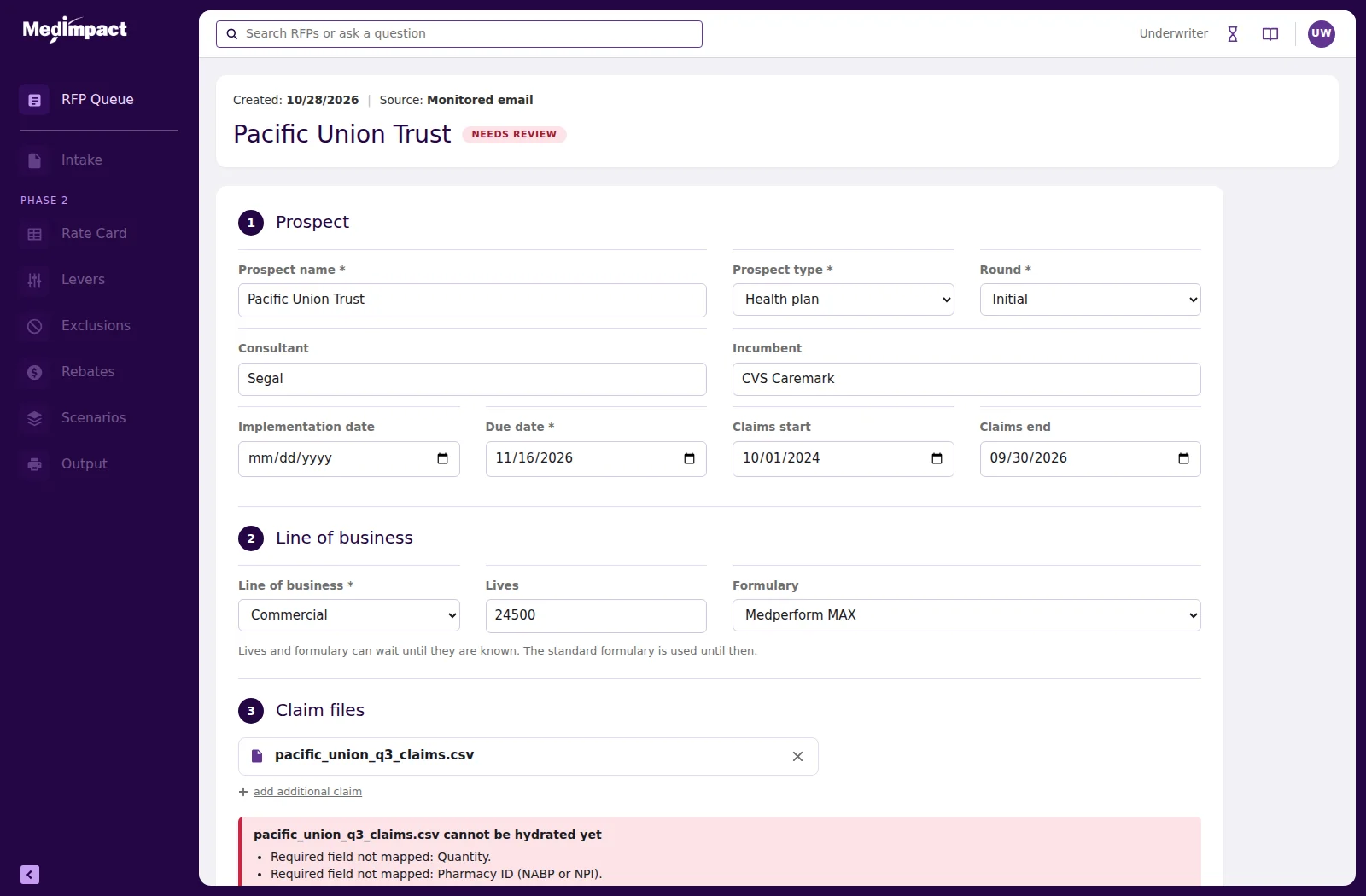
Intake page with prospect details, line of business and claim files, showing a red panel explaining that the file cannot be hydrated yet and listing the unmapped required fields.
Guided repairA claim file that cannot be processed yet, with the reasons stated plainly rather than as an error code. The rows behind each problem are highlighted, and a tooltip on each dropdown says exactly which value to pick. Fix them, re-check, and it passes — the demo data carries genuinely fixable faults so a reviewer can complete the loop.
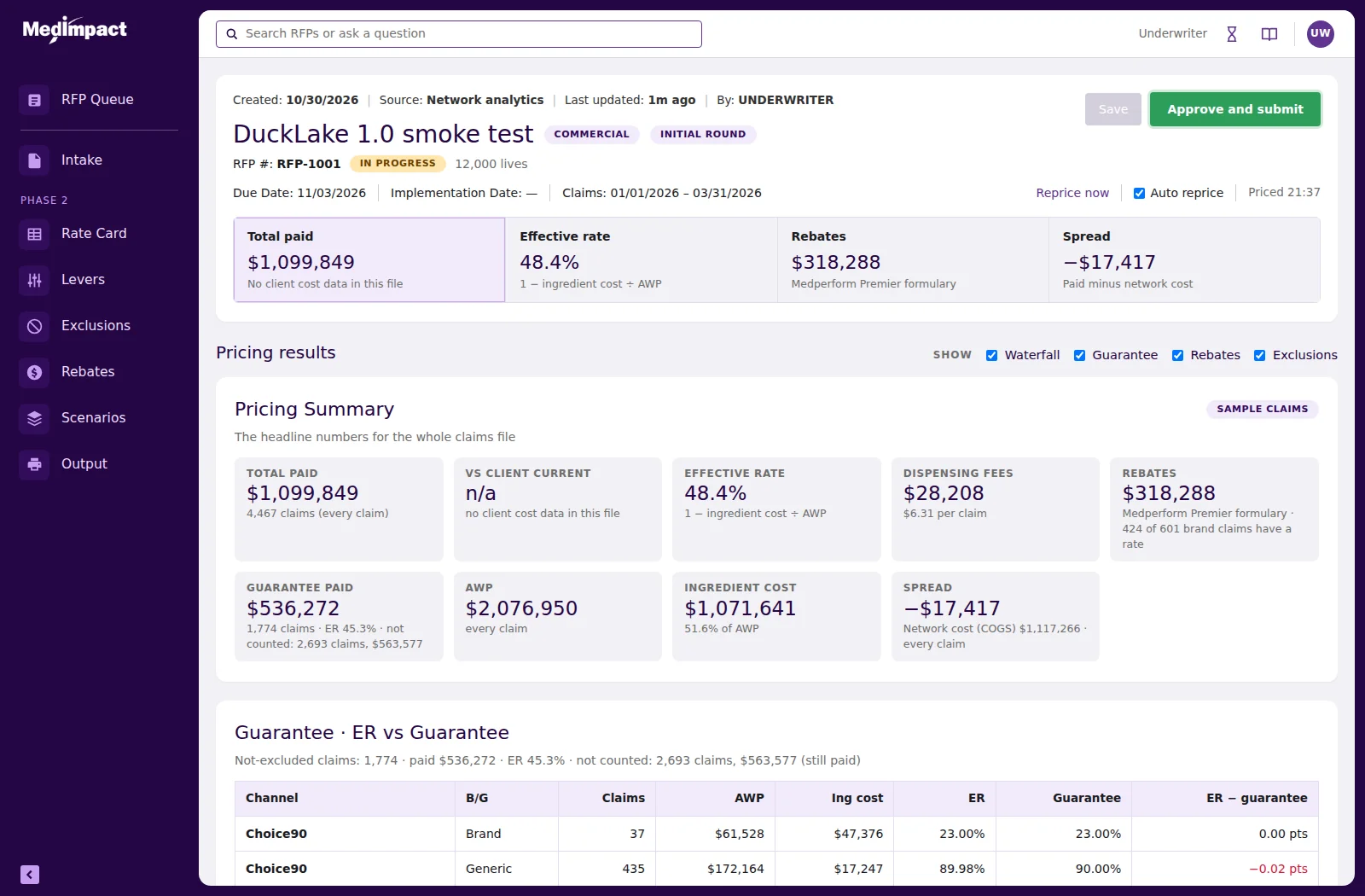
Hydrated offer page with headline figures for total paid, effective rate, rebates and spread, above a pricing summary and a guarantee comparison table.
The whole offerEvery section visible in one scrolling page, because the instruction from the product owner was to see the entire offer at all times. Inputs are read-only in place and edited through slide-over panels, so the body stays stable while a value changes. Approve stays disabled until the record is complete and saved, with the reason stated beside it.
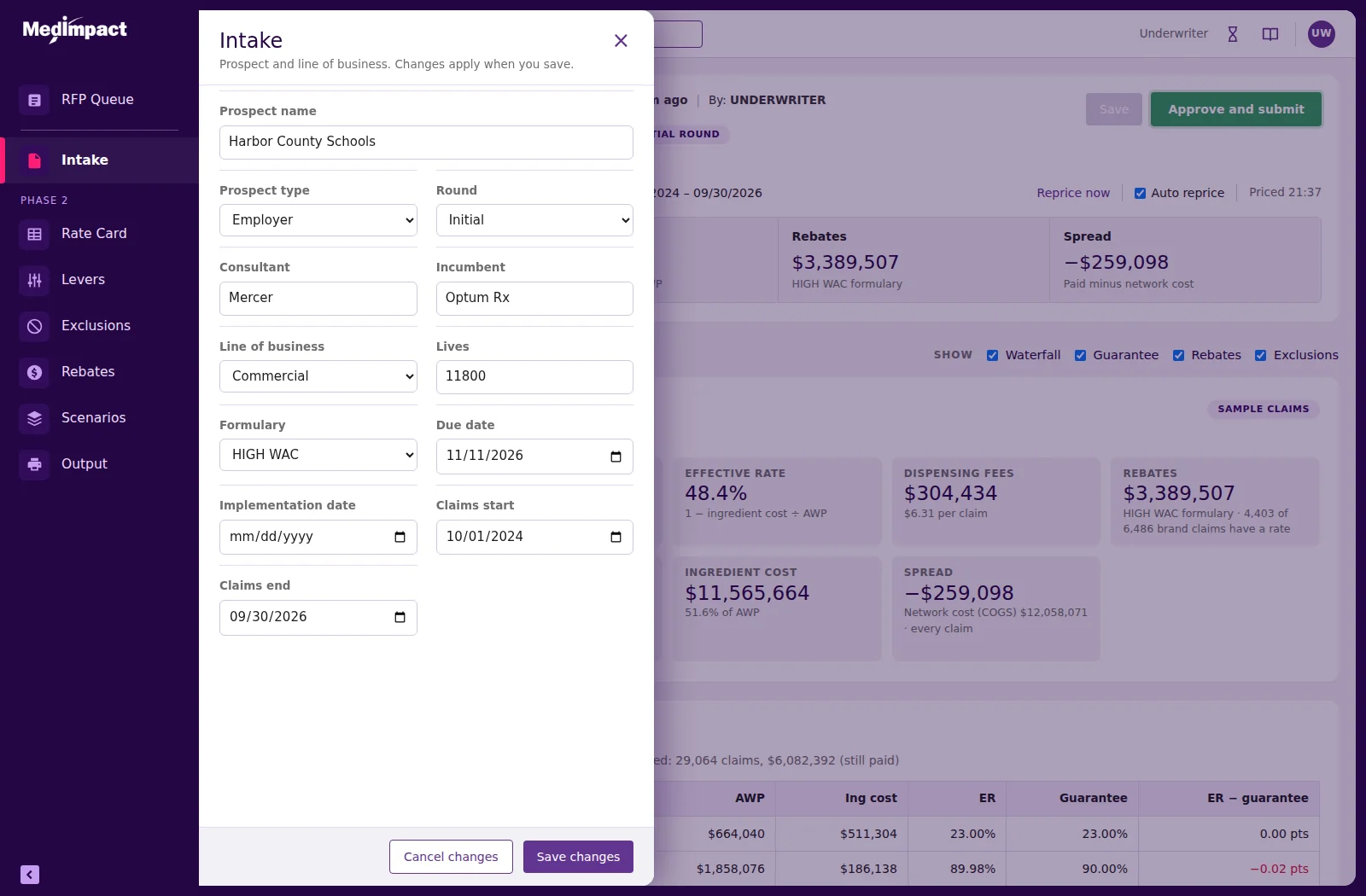
Slide-over panel opened from the left navigation over about a third of the screen, with form fields and cancel and save actions.
Editing without losing placeFormer tabs became navigation items that open a panel over roughly a third of the screen. The panel edits a draft: cancel discards it, save applies it and updates the offer behind. Leaving with unsaved edits is blocked rather than silently discarded.

The pivot, absorbed in one build

Halfway through, the operating model changed. The original requirements described four specialist roles sharing a queue. A working session replaced that with a single underwriter who owns the record end to end, fed by automated intake.

In a frame-based prototype that is a redraw. Every affected screen, every variant, every prototype link. In practice it is the moment a prototype stops keeping up with the project and quietly becomes a picture of an earlier idea.

Here the rules changed once and the product reflowed. Roles removed, statuses derived differently, intake automated with the manual path demoted to a visible exception, approval re-gated. One build. The previous version was kept intact, so the earlier model can still be opened and compared.

That is the argument for building prototypes as software. Not that it is faster to make, but that it is cheaper to change — and requirements always change.

Rapid front-end prototypingDesign systems as codeReact-ready architectureClaudeRequirements synthesisAutomated testing
1 build
to absorb a change from four roles to one
0
versions overwritten — every build still openable
0
external dependencies in the shipped file
Same session
most revisions delivered while the reviewer waited

How quality was held

Speed is only useful if the thing is right. Two layers, and they catch different faults.

Automated

before every hand-off

Each build was driven in a headless browser: open the page, click the flows, fill the fields, upload files, assert the results. The largest run was sixty-three checks. It caught initialisation-order faults and a deleted helper that would have broken the unsaved-changes dialog — both before anybody saw them.

Human

for everything else

Three of the six recorded defects were found only because the designer looked at the result and sent a screenshot. Tooltip text overflowing its box. A demo file that could never pass re-check. Mappings from one file silently applying to the next. Tests cannot judge any of those.

Stated

rather than hidden

Every hand-off listed assumptions, source conflicts and what was not built. It is a prototype: no back end, figures illustrative, mapping suggestions simulated. Saying so is what makes the rest of it credible.

Automation checks behaviour. People check judgement. Treating AI output as work to be reviewed, with tests and a human in the loop, is what made the speed safe rather than reckless.

What this means if you hire us

Three things this method is genuinely good for, and one it is not.

You get

something to react to

Not a clickable picture. A working front end your stakeholders can use with their own inputs, in a browser, in days. Opinions about a mockup are cheap; watching someone actually attempt a task tells you what to fix.

You get

a head start on the build

Tokens, a component inventory, the rules written down, test scripts and a version trail. Readable markup with state and accessibility attributes in place, structured so a React team can port it rather than start over.

You do not get

production code

This is prototype-grade and we say so. No back end, no real data layer, no security review, no performance work. It is the fastest honest way to find out whether the design is right — before anyone spends a quarter building the wrong thing properly.