Case study · Software

Claims workflow redesign

A pharmacy claims review process spread across three disconnected applications. Auditors lost their place constantly, training took months, and throughput sat flat at thirty reviews a day. We collapsed it into two screens and took it through two rounds of moderated testing before a line of production code was written. Post-launch it runs at forty-five quality reviews a day.

The problem

Pharmacy claims get reviewed in a short window before payment. Catch a discrepancy in that window and it is corrected. Miss it and the pharmacy is paid, the audit happens later, and somebody spends months chasing the money back.

So the review window is the whole value of the process, and it was being spent on navigation. Completing one review meant working across three separate applications, moving out of the workflow and back into it repeatedly to gather data that should have been on the page.

What the users said. Four people, three auditors and a supervisor, walked through a realistic scenario the supervisor wrote. Even with every piece of data available and nothing blocking them, it took too long. Two comments did most of the work in the research summary: the interface made it easy to lose track of what had been audited and where you left off, and the page carried a great deal of information nobody needed while missing things they did.

The flow had been built from accurate business requirements by people who never watched anyone use it. Everything it was asked to do, it did.
3 → 1
applications needed to complete one review
2 screens
the entire redesigned flow: a queue and a detail page
4 users
contextual inquiry across two roles
2 rounds
moderated usability testing, recorded and scripted
Wireframe to prototype

Both of these are the same tool at two stages. Axure RP, which is worth saying out loud, because the second video is only possible because of what the first one made cheap.

WireframeGrayscale, annotated, and already clickable. Layout intent written on the page — the alerts region, the exclusion area, the two-column split, the expander that pulls in external data. Structure got argued out and settled here, where changing it costs minutes.
PrototypeThe same flow at production fidelity, and genuinely functional: queue filtering, row selection, claim detail, contact history, document upload with a real file dialog, and a save that moves the claim to pending and confirms it. This is what the usability sessions ran against.

Why the tool matters here. Both artifacts came out of one environment, which meant the wireframe was not thrown away to start the prototype — it was raised. And because the prototype actually behaves, usability testing could run real scenarios against it rather than asking people to imagine what a button would do.

What we did

Not every piece of UX was budgeted for the timeline, so the work was scoped to what would change the outcome and sequenced accordingly.

Research

Before anything was drawn

Watching the work, not asking about it.

  • Contextual inquiry. Four users across two roles, stepping through a common task scenario the supervisor wrote, so the task was realistic rather than hypothetical. Pain points came from watching where people stalled, not from a survey.
  • Roles defined. Auditors, clinical analysts and credentialling analysts — different access needs and different reasons for being in the same screen.
  • Heuristic analysis. A structured read of every screen in the existing flow, which produced the evidence for the current-state model rather than an opinion about it.
  • Current and target flow models. The current flow drawn honestly, across all three applications and every touchpoint. Then the target: one access point, wizard-driven, with the touchpoint count visibly cut. Two diagrams that made the argument without a single word of persuasion.
  • Journey mapping. Scenarios run against the target model to find where it would break before anyone built it.
Design

Two pages, deliberately

The constraint was the design.

  • The queue page. A pool of available claims and a personal working queue, with claims moved between them, reassigned or removed. Tabs between the two. The fix for “easy to lose track of where I left off” is a working set that belongs to you and persists.
  • The detail page. Associated claims shown inline rather than in a second application. Only relevant claim information, ordered top-down by hierarchy. Data entry placed adjacent to the data being viewed, so there is no memorising a value and typing it elsewhere. Contact history folded into the same work area. Letter generation and document upload on the page. Global notes. Claim exclusion alerts surfaced rather than buried.
  • Whiteboard, then wireframe, then prototype. Collaborative sketching first, iterative wireframes in Axure next, and only once the structure held did anything move to high fidelity.
Testing

Two rounds, scripted and recorded

Against the prototype, before development.

  • Scenario-based, by role. Separate scripts for the supervisor and claim-entry roles, run online and recorded so sessions could be reviewed rather than remembered.
  • Delight and concern, both noted. Qualitative feedback captured, prioritised, and converted into action items — which is the step that decides whether testing changes anything.
  • Two rounds, not one. The second round tested the changes the first round produced. One round finds problems; two rounds confirm the fixes work.

The screens

Built against the client’s design system as it stood in 2022 — an older system than the one they run now, and the work was done within it rather than around it.

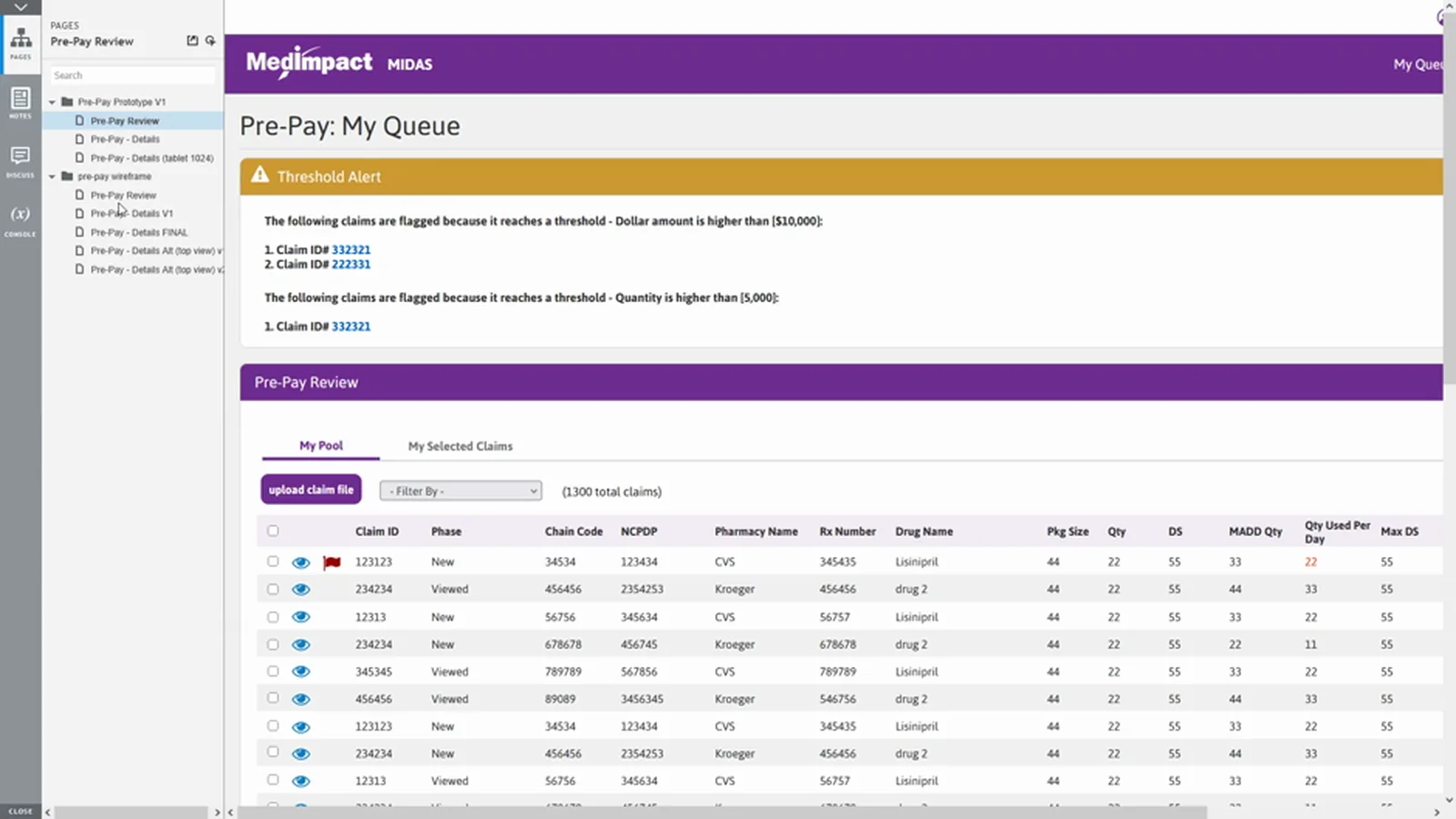
Grayscale wireframe of the claims queue with a threshold alert panel listing flagged claims, pool and selected tabs, and a claims table.
WireframeThe queue at wireframe stage, including the threshold alert panel that flags claims breaching dollar or quantity limits — a feature users had wanted for a long time and had been living without.
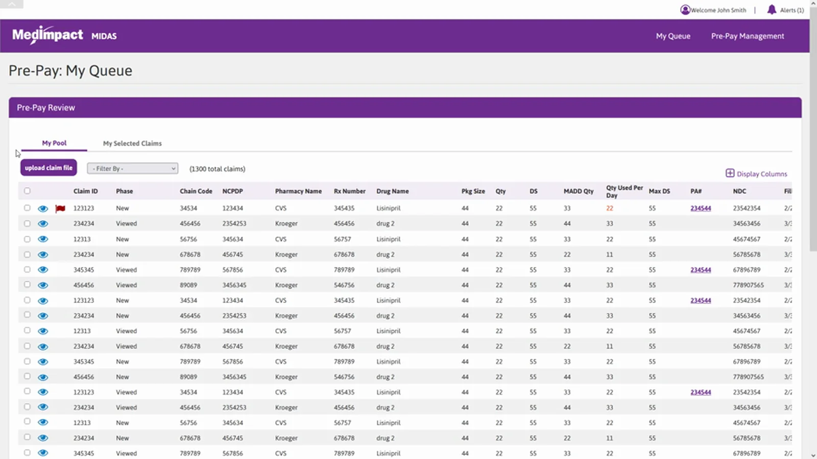
Final claims queue: pool and selected claims tabs, filter and upload controls, and a wide claims table with column display options.
QueueThe same screen built out. Pool and working queue as tabs, filtering, column selection, and a claim count — a working set that stays yours between sessions.
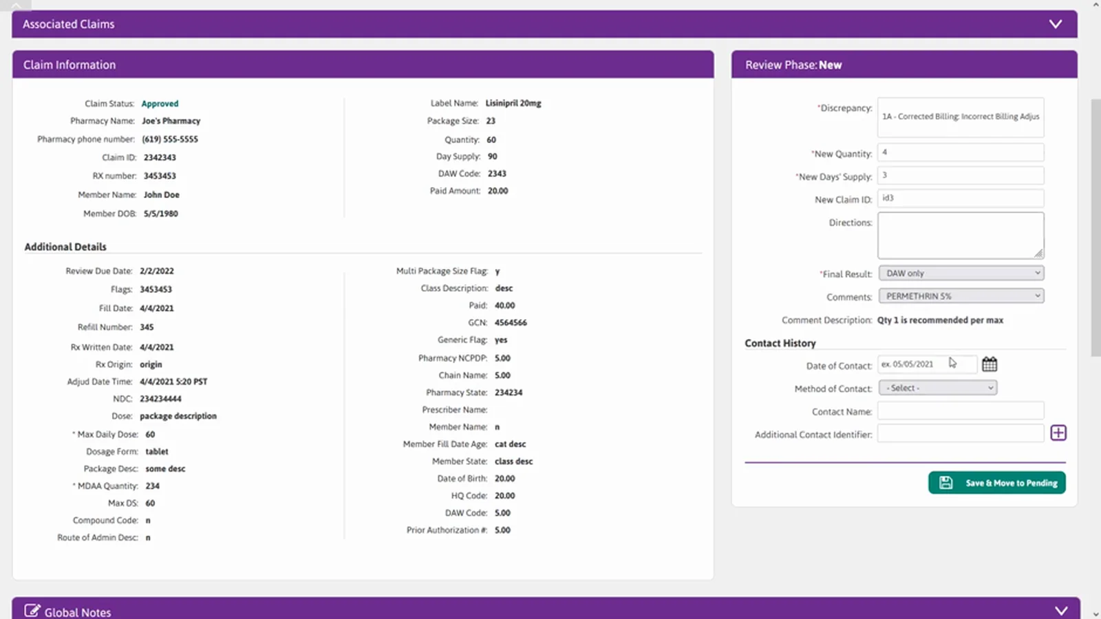
Claim detail page with claim information and review phase panels side by side, additional details, contact history, global notes and a letters and documents section.
DetailEverything a review needs on one page: claim information beside the review phase entry fields, associated claims inline, contact history, notes, and document handling. The three applications collapsed into this.

What happened after launch

The application was built and launched. These are measured post-launch numbers, not projections.

Throughput rose by half. From roughly thirty reviews a day to forty-five, and the word the client used was quality reviews — the increase did not come at the cost of the work being done properly.

The per-claim time tells the clearer story. Twelve minutes down to seven. Across a working day that returns about two and a half hours to every auditor, which is the number that actually gets noticed in an operations meeting.

And two effects nobody asked for. Input errors fell, because there are fewer places to make them when data entry sits beside data display. And training time halved, because a new auditor learns one screen instead of the seams between three applications.

This redesign has exceeded our team’s expectations. There were some metrics around reduced clicks and improved workflow, but the ease at which the users can now complete tasks is very impressive. In addition, onboarding new trainees will be much easier with this new process.
Supervisor, claims audit team
Enterprise healthcareWorkflow redesignContextual inquiryAxure RPUsability testingDesign system work
30 → 45
quality claim reviews completed per day, per auditor
12 → 7
minutes to complete a single claim review
2.5 hrs
returned to each auditor every working day
Halved
time to train a new auditor
Reduced
input error, from fewer places to make one

What you get from a workflow redesign

This is what the engagement produces. The tooling has moved on since; the method has not.

You get

the flow as people actually run it

We sit with the people doing the work and watch them attempt real tasks. The original flow here met every requirement in its specification and was still painful to use — those are different tests, and only one of them is in the document. You get the observed flow, the workarounds nobody wrote down, and a defect list ranked by what each one costs per day.

You get

a prototype tested twice before anyone builds

Two rounds of moderated testing against a prototype that responds like the product, not a clickable picture. Defects found at that stage cost an afternoon to fix. The same defects found after the build cost a sprint, and some of them never get fixed at all because by then the code is load-bearing.

You do not get

a new design system

We work inside the one you already have, as it exists today, not a nicer one invented for the pitch. A redesign that ignores the system in place produces screens your engineers cannot ship. If the system itself is the problem, that is a separate conversation and we will say so.